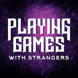
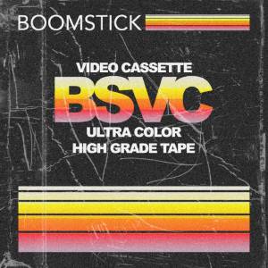
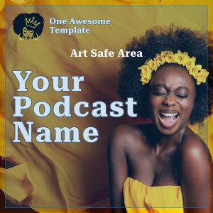
 Podcast artwork offers a visual representation of your show. It is often the first thing prospective listeners see when considering whether to subscribe to a podcast. Eye-catching and communicative artwork for podcasts is essential when competing in an ever-growing digital space. Your podcast artwork is an important representation of your brand. It is defined by how it makes its listeners feel and even builds the curiosity factor for nonfollowers.
Blubrry Podcasting team members, composed of podcasters dedicated to advancing podcasting, understand that when creating the best podcast artwork, many considerations come into play. From selecting a thematic color scheme to incorporating typography that resonates with the intended audience, the number of elements involved in creating compelling artwork is vast.
The PowerPress plugin for WordPress, offered by Blubrry, provides this guidance on universal sizes for artwork on that platform, which adheres to the overarching standards of podcast artwork best practices.
Podcast Artwork Ideas
 Podcasting has emerged as an essential communication, storytelling, and marketing tool. The visual appeal of your podcast, distinguished by its artwork, can significantly influence your show’s appeal and listenership. Art ideas serve as the indelible face of your brand, creating visual cues that communicate the essence of your podcast. Creativity, aesthetic appeal, relevance, and clarity should guide your thought process when deciding on the ideal artwork for your podcast.
Many podcasters look to leading-edge tools such as Canva, and others. Apple even provides a template to help in the creation of your show and episode art. These tools include extensive themes, images, and font libraries to craft personalized cover art. Additionally, they ensure that the cover art size adheres to industry standards, typically a square image of at least 1400 x 1400 pixels but no larger than 3000 x 3000 pixels.
To enhance the podcasters’ experience, a cover template can be a valuable tool. These templates simplify the design process while still allowing flexibility and personalization. They serve as a starting point for podcasters to build their unique brand image. Thoughtfully chosen and well-crafted artwork will continue to be significant as podcasts thrive in the digital landscape.
Creating Visionary Artwork
 Creating artwork is an integral part of establishing a podcast’s brand and identity. The visual elements associated play a vital role in attracting and retaining listeners, offering them a snapshot of the nature and quality of the content they are about to consume. Enhanced by numerous cover-art generators and cover design templates, producing professional and appealing artwork has become increasingly accessible, even for those who lack graphic design expertise.
Podcast cover art generators have revolutionized the process of creating artwork for many reasons.
- First, they remove the hurdles associated with the technical nuances of graphic design, allowing podcasters to focus on the narrative essence of their shows.
- Second, these generators often include preset design templates and functions, allowing for customization and ensuring that the result is a perfect reflection of one’s podcast brand.
Similarly, cover-design templates offer starting points for creating custom podcast artwork. With myriad styles and formats available, they cater to a broad spectrum of podcast themes and genres. Whether you’re keen on minimalist aesthetics, vibrant color palettes, or anything in between, you’ll likely find a template that resonates with your vision.
However, as much as design and aesthetics are emphasized, understanding the technical aspects such as size and podcast artwork requirements is equally relevant. Most podcast directories, including Apple Podcasts and Spotify, maintain specific standards for podcast artwork dimensions (see Apple Podcasts artwork requirements). Both require the image to be square and at least 1400×1400 pixels but no larger than 3000×3000 pixels resolution. Ignoring these technical necessities could result in your podcast artwork being rejected or displayed poorly in podcast directories.
What is The Rule of Thirds?
 Also considered is the “Rule of Thirds,” an artistic principle in podcast artwork that emphasizes balance and visual appeal, making the design eye-catching and memorable. According to this rule, the artwork is divided into three equal sections, horizontally or vertically, creating a grid-like structure. This layout helps strategically place critical elements of the design, such as the podcast’s title, logo, and any relevant imagery or text. The artwork achieves a sense of proportion and focus by aligning these elements within the three sections. This rule guides the viewer’s eye smoothly across the artwork and ensures that no single element overwhelms the others.
The Blubrry team has found artificial intelligence (AI) beneficial in generating podcast episode art, which can quickly allow you to have unique art for each episode. AI tools, when used correctly, can analyze the subject and tone of the podcast and then produce suitable and visually striking artwork.
Blubrry provides publishing features that help showcase individual episode art in the dashboard. The visual elements interest podcasts, making them more engaging and appealing to listeners. By integrating an artistic touch into each episode, podcasters have the opportunity to differentiate their content, giving audiences additional reasons to keep coming back for more.
Podcast Artwork Template


Blubrry’s Podcast AI Assistant, part of the Thrive Bundle add-on, makes creating AI-generated images for episodes and album art as simple as writing the proper prompt!
Creating visually compelling podcast artwork is essential to your podcast. The use of an artwork template — whether through Blubrry’s AI — or otherwise — can significantly aid the process of crafting attractive, professional designs. These templates are readily available and can be tailored to suit your podcast’s unique aesthetic vision. They serve as a valuable tool for both enthusiastic beginners and seasoned professionals.
The development and customization of these templates extend beyond standard graphic design tools. Many have explored innovative solutions like leveraging artificial intelligence artwork for podcasts, adding a unique new dimension to cover designs. These AI-assisted designs are popular among podcast creators looking for a more distinctive, innovative edge in their podcast artwork.
A common and user-friendly platform for crafting cover art is Canva, which offers various podcast cover art templates. These templates offer a great starting point and can be easily customized to match a podcaster’s branding and creative philosophy.
Artwork designers also have a wealth of options at their disposal. Between AI technology, user-friendly platforms such as Canva, and the support and guidance of experienced teams like Blubrry, designing podcast cover art is a task that offers creative potential. This combination of technology and creativity further fuels the growth of engaging and attractive podcast artwork design ideas.
Podcast Artwork Size
 Recognizing the significant role of podcast artwork, podcasters should know the necessary dimensions to optimize their content. Utmost precision is key when considering Apple podcast artwork requirements. Podcasters need to strike a balance between resolution and dimension in their cover art. When viewing your podcasts on Apple devices, your artwork must be spot-on, this is where your alliance with Blubrry becomes beneficial as they have mastered these constraints.
Within Blubrry’s platform, creators can showcase individual episode artwork on their dashboard. This feature enhances the user interface, adding vibrant color and interest to each podcast episode. This feature appeals to listeners and lets creators denote themes or moods, making each episode visually distinct.
Podcasters have the unique feature of showcasing an art gallery for individual episodes on the dashboard. Through this, a myriad of colors and designs can be leveraged to pique listeners’ interest and set each episode apart. A podcast cover art generator is a remarkable tool that will let your creativity soar while adhering to requirements.
With varying platform requirements, a podcast artwork size converter can be a handy tool. It seamlessly adjusts your artwork size to different platform specifications, ensuring a smooth transition in your podcasting journey. Trust the Blubrry team to support and simplify your digital podcasting needs.
Blubrry has recognized the appeal of featuring individualized artwork for each of its Podcast Insider episodes. A feature built within its dashboard allows podcasters to display different art for individual episodes, adding color and interest for the listeners. This personalized touch can significantly enhance a listener’s connection to the episode, increasing engagement and amplifying the viewing experience.


