There are a lot of great podcasts out there – but unfortunately, they are often accompanied by ineffective or poorly-designed cover art that doesn’t do the show justice when potential listeners scroll past. The good news? If you follow a few basic principles, you can elevate your show to stand out in a crowd. Last week we shared 5 tech tips you need to know to create great podcast cover art. In today’s post we’re covering design principles with Blubrry Creative Director Brian Yuhnke.
5 Design Principles To Help Your Podcast Art Stand Out
- Use Color Wisely: Color is definitely subjective: the palette you love may not be another podcaster’s cup of tea. But color offers a huge opportunity to make your podcast stand out, and you will be on the right track if you follow two basic guidelines: go for an eye-catching color scheme, but limit the number of colors you use. “Three, maybe five colors, tops,” recommends Yuhnke. “Sitting next to something that’s black and white or uses way too many colors, yours will shine as simple and elegant.” But consider your brand identity, too: “If you have a strong, identifiable logo, you can sacrifice color and even some layout and your art will still work. But if your logo is terrible or nonexistent, then you better be doing some other things to bring out your brand and make your album art stand out.”
- Avoid Cliches: Unless your podcast is actually about podcasting, does a mic in the cover art make sense? It’s hard to make your podcast stand out when it’s advertised with over-used imagery, Yuhnke points out, and the ubiquitous microphone can look downright tired. Scan through podcast directories and see which kinds of images consistently come up. Portraits, cartoons, and RSS icons also stand out to Yuhnke as over-used. Bottom line: make sure any imagery you’re using in your cover art is unique and has a clear tie to your podcast’s topic and theme.
- Use Grid-Based Design: By creating a grid and designing over it, you can avoid amateur designer mistakes like elements that don’t quite line up properly and create a more visually-pleasing end product, says Yuhnke. But don’t worry about keeping everything too linear: “Not every element has to line up with the same X and Y lines,” he points out. “You can have two elements lining up to one another while three others are lining up on a separate axis.”
To demonstrate, Yuhnke took a quick stab at this podcast’s cover art. The first image was created without the use of a grid, and the second just took a few minutes to fix and line up more properly on a grid.
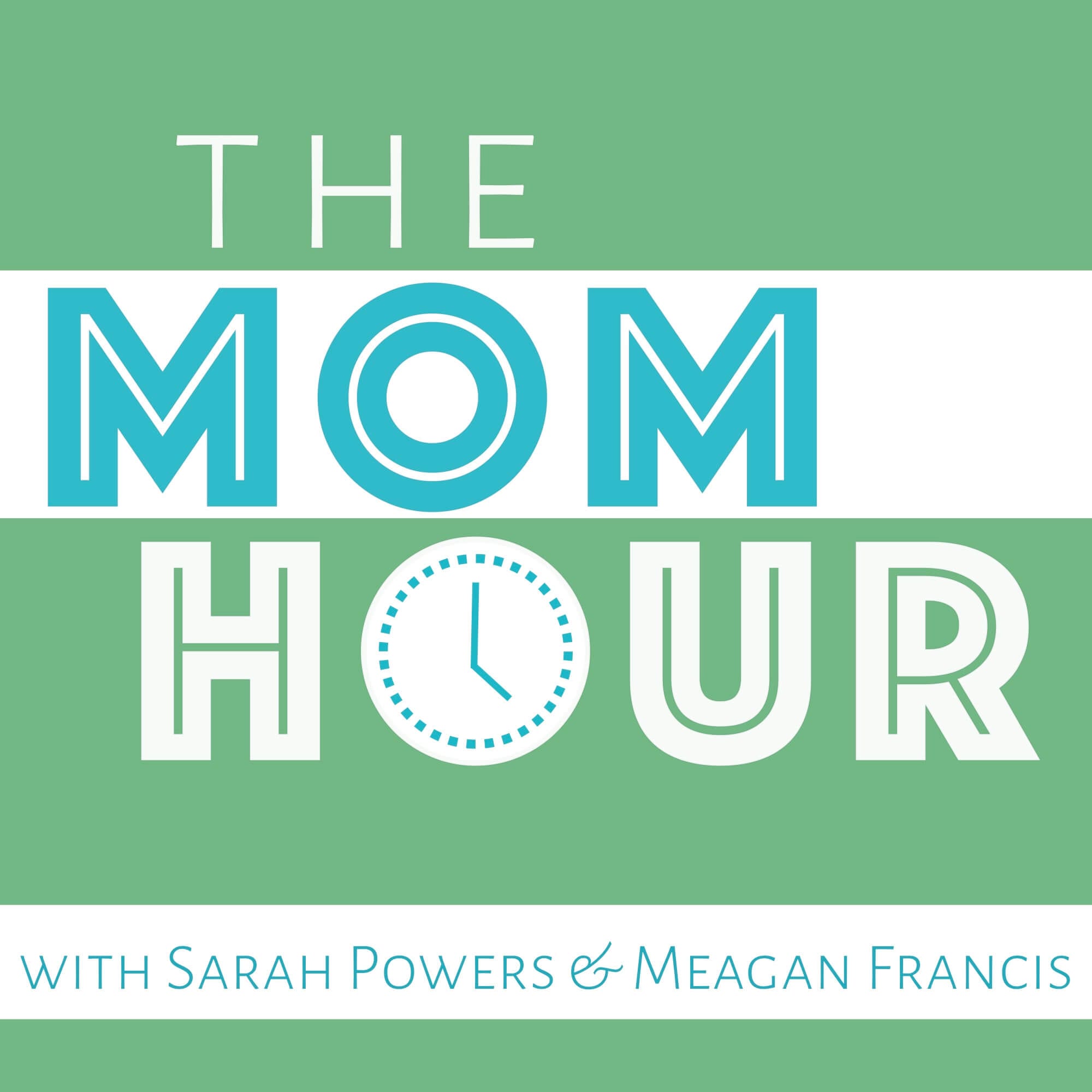
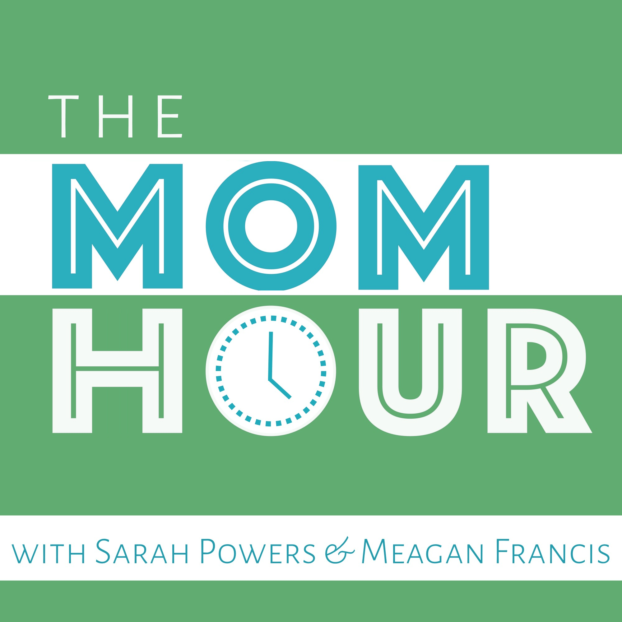
Can you see the difference?
4. Use The Rule of Thirds: This is an extension of grid-based design and an idea that has its roots in video and photography. By placing text and other interesting or important elements within the focal point of your art, the overall composition becomes more interesting, says Yuhnke.
5. Make Sure It’s Readable: Many would-be listeners are scrolling through directories on small screens with teeny-tiny icons. Can they even see your cover art well enough to tell what your show is about? “Many times your cover art appears on a small screen next to 10, 20, or 50 other shows,” explains Yunke, “A listener needs to be able to take one click glance at the art and get a sense of what your show is about.” The real test? “Shrink your art down to 90px by 90px. If you can still comprehend the art at that size, then that’s a huge step in the right direction.” This is one area in which your choice of font will make a big difference. “With fonts, keep it simple: use one or maybe two fonts in your album art, and make sure the text is readable, especially at a small size.”
Which of these design principles could you put into effect right away to improve your podcast cover art?